

Overview
This project was one of my first UX design sprints and focused on creating a simple and intuitive to-do application. The goal was to explore core UX principles such as task organization, usability, and clear interaction patterns.
While the sprint began as a structured exercise, it became an opportunity to practice translating everyday user needs into a functional digital experience.
Problem
Many productivity apps become overly complex, making it harder for users to quickly capture and manage tasks.
Users need a simple and frictionless way to:
• Add tasks quickly
• Track progress
• Stay organized throughout the day
The challenge for this sprint was designing a minimal, easy-to-understand task management interface that reduces cognitive load.
My Role
UX / Product Designer
Responsibilities included:
• Interface design
• Layout and interaction decisions
• Visual hierarchy and usability considerations
Goal
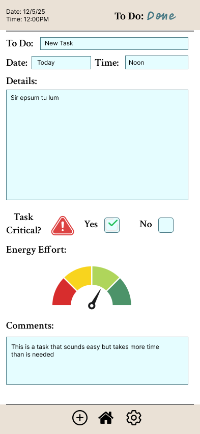
Design a to-do application that allows users to quickly create, organize, and complete tasks with minimal effort.
Key goals included:
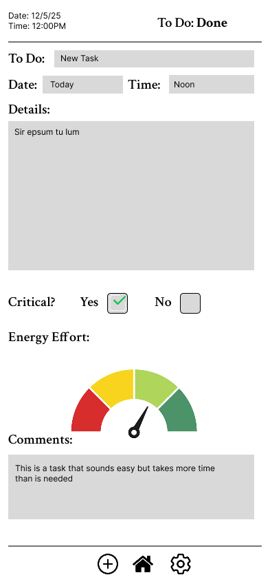
• Simple task creation
• Clear visual feedback when tasks are completed
• Clean layout that prioritizes usability
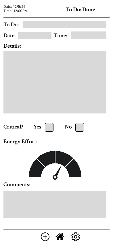
Wireframing
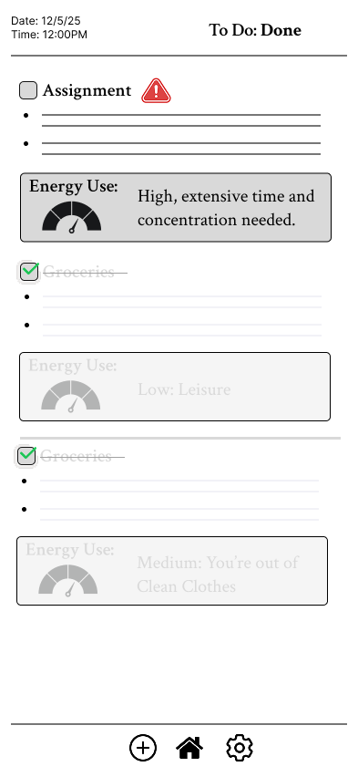
Early wireframes focused on the task list as the primary interface element, ensuring users could easily scan and interact with tasks.
Design considerations:
• Large tap targets for mobile usability
• Clear checkmarks for completion
• Simple vertical task list layout
Key Design Decisions
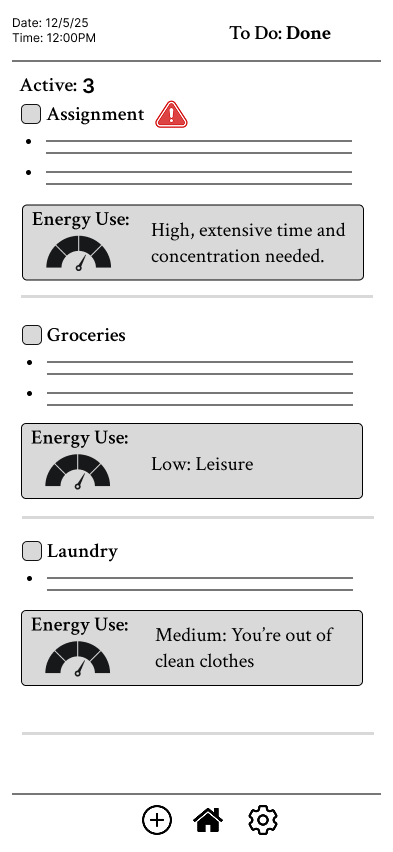
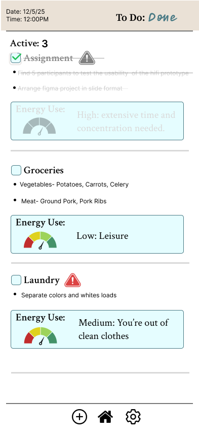
Task-First Layout
The main screen prioritizes the task list, making it immediately clear what the user needs to do.
Clear Completion Feedback
Completed tasks are visually marked with check icons to provide immediate feedback and reinforce progress.
Minimal Interface
Reducing unnecessary UI elements keeps the experience fast and distraction-free.
Outcome
This sprint helped me practice designing a complete mobile interface from concept to visual design. Although it was an early project in my UX journey, it reinforced the importance of clarity, hierarchy, and simplicity in productivity tools.
The experience strengthened my ability to translate everyday workflows into intuitive digital interfaces.
What I Learned
• Simple interactions are often the most effective
• Clear visual hierarchy improves usability
• Designing productivity tools requires minimizing cognitive load