

Food Blog Design Sprint
Overview
This project began as an instructional sprint focused on learning how to design and structure a food blog. While the sprint provided a basic framework, I used the opportunity to explore my own visual style and UX decisions, turning the exercise into a more personalized design project.
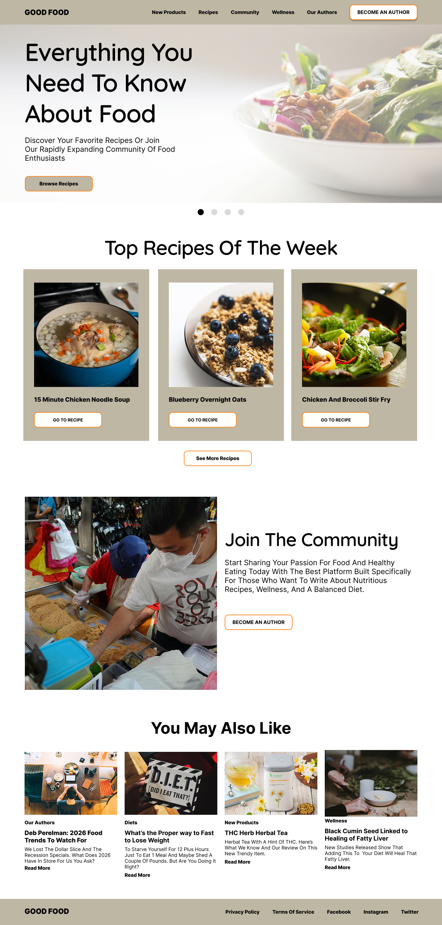
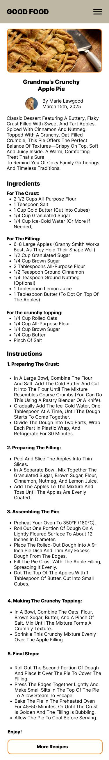
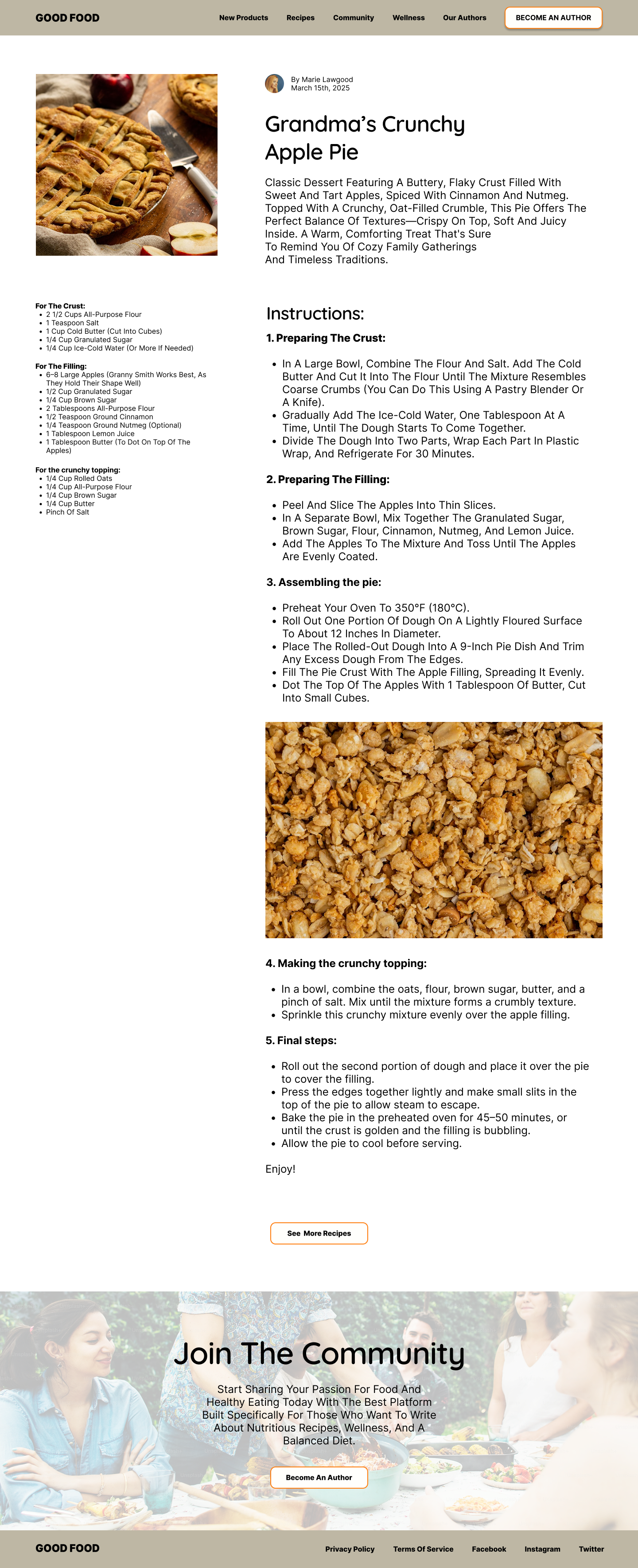
The final result is a modern, minimal food blog concept that highlights communal dining, clean layout systems, and approachable food content.

Problem
Food blogs often suffer from cluttered layouts, overwhelming ads, and difficult navigation that make it harder for users to quickly find recipes or enjoy the content.
The challenge for this sprint was to create a clean and inviting food blog experience that allows users to easily browse content while maintaining a strong visual identity.
Key Design Decisions
Communal Visual Theme
Instead of focusing only on individual dishes, I incorporated imagery that shows food being shared. This reinforces the emotional connection people have with cooking and eating together.
Minimal Interface Design
I prioritized whitespace, neutral tones, and simple typography to keep the experience calm and easy to navigate.
Content-First Layout
Recipes and food imagery take center stage, allowing users to quickly scan and engage with content without visual clutter.
Approach
Using the instructional sprint as a starting point, I expanded the project by applying my own design perspective and focusing on clarity, visual hierarchy, and emotional tone.
Key areas of focus included:
• Minimalist layout to reduce distractions and emphasize content
• Communal food imagery to evoke warmth and shared experiences
• Clear typography and spacing to improve readability
• Modern visual styling to create a sophisticated but approachable feel
Outcome
The sprint evolved from a simple instructional exercise into a personalized design exploration. By applying my own design decisions, I was able to transform the framework into a polished concept that reflects my interest in modern, user-centered digital experiences.
This project helped reinforce how thoughtful visual design and layout choices can create a more enjoyable and intuitive experience for users.