

SightMark
Mark what matters.
Helping users discover and share meaningful content through a simplified social experience.
Role: UX Designer
Timeline: 2 weeks
Tools: Figma, FigJam
Platform: Mobile app, iOS app and desktop
The Problem
Social platforms are designed around endless scrolling rather than meaningful discovery. Users often struggle to save and organize content they actually care about.
Project Goals
• Improve how users discover content
• Make saving content simple and intuitive
• Reduce clutter from traditional social feeds
Research
User Interviews:
Interview 1: Claudia V
Age: 39
Occupation: Sous Chef
Location: Birmingham, Virginia
Key Takeaways
Uses Google Maps and other Avery apps to do bird watching
Finds reviews too be inaccurate and needs a more updated locations to keep up with bird migrations
Enjoys discovering “hidden” spots more than popular attractions
Needs
Friction-less posting
Trustworthy, authentic recommendations
Pain Points
Sponsored locations feel inauthentic
Too much text to skim through
Interview 2 Diana V
Age: 41
Occupation: Content Creator
Location: Ann Arbor, Michigan
Key Takeaways
Uses Google Maps, Tiktok and Instagram to find places to see
Fairly private and usually takes photos for their own memory
Enjoys discovering “hidden” spots more than popular attractions
Needs
A better way of filtering and organizing saved locations
A friction-less way to post something, they’re usually lazy about it.
A award system that actually gave some sort of prize for the work put in to find these places
Pain Points
Categorizing and bookmarking are hard to filter through
Interview 3 Cindy C
Age: 36
Occupation: Human Resources
Location: Queens, New York
Key Takeaways
Takes photos for their personal memory, doesn’t think their photos are worthy of praise
Needs
A more accurate
Trustworthy, authentic recommendations
Pain Points
Reading too much makes them uninterested
Some times posted locations aren’t accurate
Some locations aren’t listed since they’re such hole in the walls
User Research Questions
How often do you explore new places in your city?
What types of places do you enjoy discovering?
How do you usually find new places to visit?
Which apps do you use for discovery or navigation?
What frustrates you about using those apps?
What makes you decide not to check in or leave a review?
What motivates you to share photos or recommendations?
Would points, badges or a competition encourage exploration?
Why or why not?
Key Insights
Users Prefer Visual Discovery Over Text-Heavy Research
Users Avoid Contributing When It Feels Like Work
Users Want Discovery to Feel Meaningful
Exploring Solutions
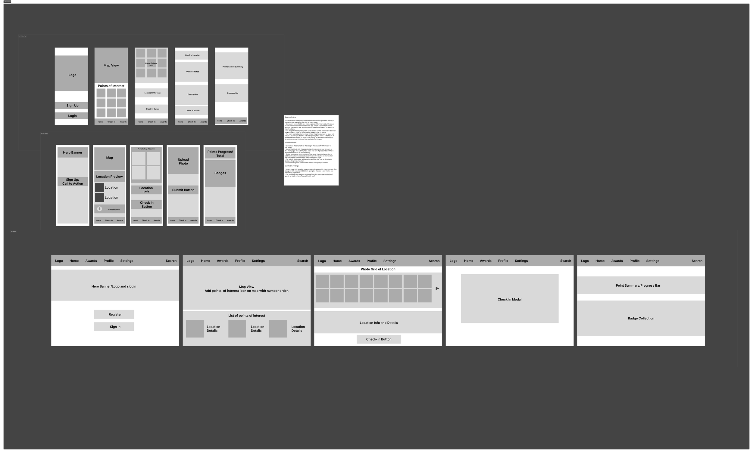
Wireframes
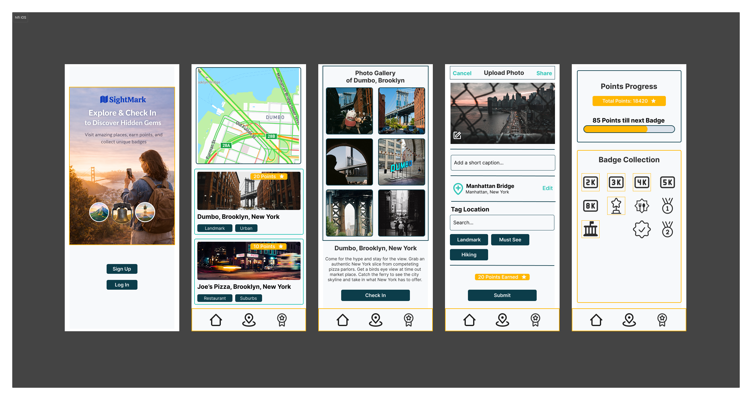
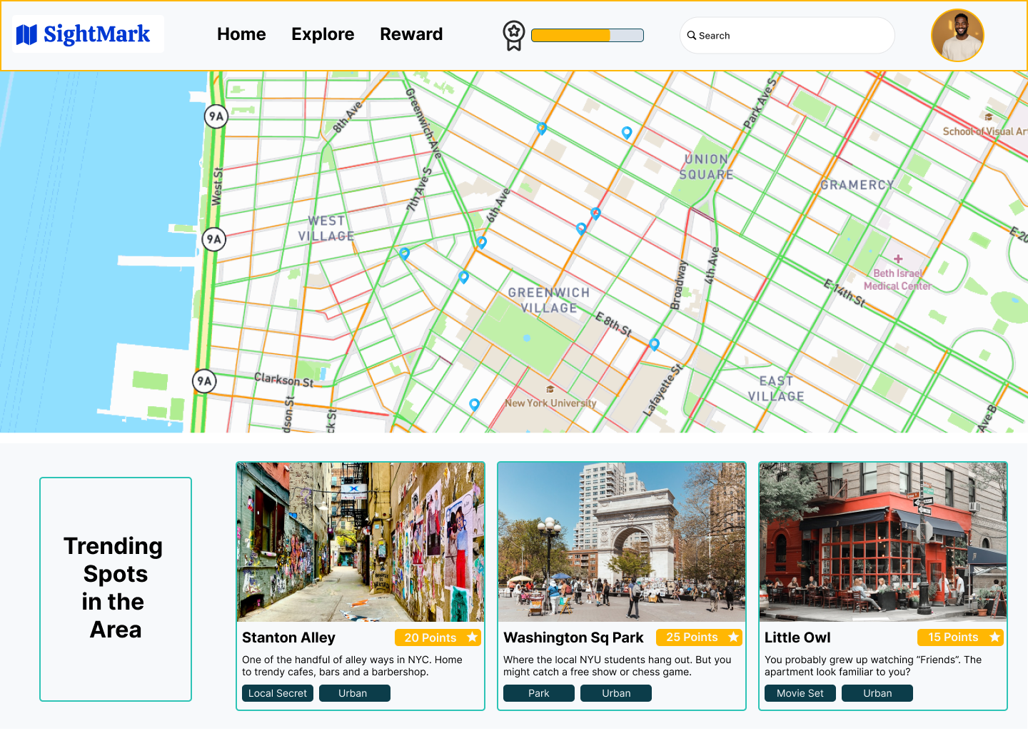
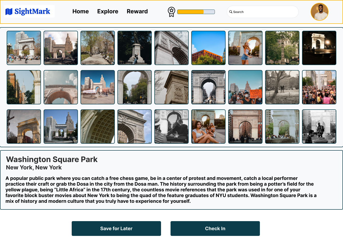
Final Design
Reflection
What I Learned
Designing SightMark reinforced the importance of simplifying discovery experiences. Future improvements would include testing recommendation algorithms and refining content organization features.